 On October 6, 2017, The Wolfsonian–Florida International University unveils a pair of graphic-design presentations, historic and contemporary, under the shared theme of “identity.” Centered on the work of Julius Klinger, a pioneering graphic artist of the early 20th century, the suite is grounded by the first U.S. solo show devoted to the designer, Julius Klinger: Posters for a Modern Age. The retrospective marks a unique opportunity for visitors to experience so much of Klinger’s work in one place—over 100 posters, prints, drawings, and book illustrations from his prolific career, along with items of decorative art by other Viennese designers selected chiefly from The Wolfsonian’s collection. The transformative designs reveal his knack for infusing beautiful imagery with wit and an astute marketing sensibility.
Complementing Julius Klinger is Double Vision, a two-part contemporary installation by Vienna-based design studio Seite Zwei that nods to the artist’s lasting influence through Klinger-inspired graphics on the Wolfsonian façade and in its lobby. The site-specific intervention—which incorporates perception-shifting lenticular prints—dissects the “graphic DNA” of Klinger’s work, activating the museum with typefaces, abstract forms, and bold color schemes. Both projects delve into issues of dual identities in graphic design (the client’s, and the artist’s) and will be of special focus for Miami Art Week 2017. They will remain on view through April 1, 2018.
“The art of persuasion is a key interest of The Wolfsonian, and Klinger was a master,” said Wolfsonian director Tim Rodgers. “Through his compelling graphic work and Seite Zwei’s imaginative reinterpretation, our visitors will consider the power of design in affecting change, often by using tactics still employed by advertisers, corporations, and brand influencers today. Together, these shows are the perfect backdrop for Art Basel Miami Beach, when the attention of the entire art world homes in on design.”
Klinger (1876–1942) was born in Vienna to a Jewish family and established his reputation as a prominent graphic artist, illustrator, typographer, and writer closely associated with the Vienna Secession art movement and Jugendstil, the German variant of Art Nouveau. Working in Austria, Germany, and briefly the United States, Klinger helped create or modernize the image and identities of countless clients ranging from theaters and cabarets, art manufacturers, and commercial companies to public agencies over the course of three decades. After the Nazis’ annexation of Austria in 1938 and the outbreak of the Second World War, he was killed in 1942 at an extermination camp near Minsk.
Central to Julius Klinger are the strong, striking graphic elements that became his signature style and reflect his direct approach to communication: bold color; minimalist, clear visuals stripped of unnecessary detail; and linear compositions influenced by Japanese prints and calligraphy. Klinger distinguished commercial art, serving a client’s goals and messages, from fine art, which he argued prioritized self-expression—a trajectory that paved the way for the emergence of “Reklamekunst” (advertising art) and graphic design as specialized fields.
Works on view at The Wolfsonian include:
A poster for Die Lustige Blätter [The Funny Pages], a leading satirical magazine, that features fishing centaurs in a fantasy scene (1909);
A poster for Hollerbaum und Schmidt (1910), in which Klinger amusingly advertised the Berlin printer’s services through his own self-portrait;
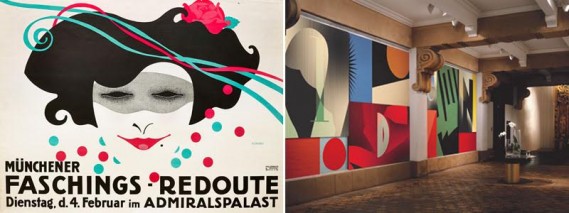
A poster for Münchener Faschings-Redoute [Munich Carnival Ball], designed for the city’s carnival season (1914);
A poster for TABU (1919) that showcases Klinger’s skill in using graphic line to define the identity for the cigarette-paper company;
Intricate illustrations for Die Aegyptische Helene [The Egyptian Helena], a book based on Richard Strauss’ opera (c. 1928); and
An announcement for a ten-week course on advanced poster design led by Klinger at
The New School, New York, proudly proclaiming him “Europe’s most prominent poster artist” (1932).
Select objects by Klinger will be placed in dialogue with works in a variety of media by other artists of the time, including Josef Hoffmann, Gustav Klimt, and Dagobert Peche. These ancillary objects provide greater context and depth to the motivations behind Klinger’s trademark style and design choices.
“Klinger was a designer whose work resonates today for its charm, flair, humor, and variety,” said Jeremy Aynsley, guest curator and professor of design history at the University of Brighton. “He was an outstanding draughtsman who captured the elegance of the times in his posters, yet also made strongly satirical images that engaged with the issues of the day.”
In their contemporary response, Double Vision, Seite Zwei constructs a Klinger-esque landscape in the Wolfsonian lobby that captures the dual nature of graphic identity—how it expresses both the client’s brand and the designer’s individual creativity. Lenticular prints speak to this dualism by interlacing images that change based on viewing angle, giving the appearance of animation. The dynamic effect challenges visitors to recognize the layered meanings in the simplest of images. On the museum’s exterior, lettering inspired by Klinger’s advertisements for TABU announces Klinger’s name as at the heart of the season.
The studio explains, “Looking back at Klinger’s work, it is evident that in order to have a lasting effect on the development of design and culture, one should not only be able to create, but more importantly reflect and be aware of the state of one’s craft and its cultural context. Here in Austria and around the world, Klinger’s stamp on graphic design is undeniable.”